vue--组件开发
目录一、button 组件开发1.1 整体目标1.2 确定组件API1.3 编写测试基础Button1.4 完成type配置1.5 完成size配置1.6 完成事件绑定1.7 总结二、Editor编辑器组件开发2.1 确定基础API2.2 编写测试基础Editor2.3 完成v-model双向绑定2.4 总结一、button 组件开发1.1 整体目标了解组件开发的整体流程掌握组件事件和标签事件的区
目录
一、button 组件开发
1.1 整体目标
- 了解组件开发的整体流程
- 掌握组件事件和标签事件的区别
- 掌握在组件上使用v-model的方式
1.2 确定组件API
属性
| 属性名 | 说明 | 类型 | 默认值 |
|---|---|---|---|
| type | 设置按钮类型,可选值为 primary danger 或者不设 |
String | default |
| size | 设置按钮大小,可选值为 small large 或者不设 |
String | default |
事件
| 事件名称 | 说明 | 回调参数 |
|---|---|---|
| click | 按钮点击事件 | (event) => void |
1.3 编写测试基础Button
组件有很多的功能,但是这些功能都是由一个最原始的组件逐渐扩展而来的,所以我们先完成一个最基础的button组件,然后逐渐往上添加功能
编写Button组件
目的:完成基础结构 + 基础样式
components/Button/index.vue,
<template>
  <button class="h-btn">
    <slot></slot>
  </button>
</template>
<style scoped lang="less">
    // 默认背景色 默认大小 基础样式 不管传什么参数这个样式都在
    .h-btn {
      line-height: 1.499;
      position: relative;
      display: inline-block;
      font-weight: 400;
      white-space: nowrap;
      text-align: center;
      background-image: none;
      box-shadow: 0 2px 0 rgba(0, 0, 0, 0.015);
      cursor: pointer;
      transition: all 0.3s cubic-bezier(0.645, 0.045, 0.355, 1);
      -webkit-user-select: none;
      -moz-user-select: none;
      -ms-user-select: none;
      user-select: none;
      touch-action: manipulation;
      padding: 5px 10px;
      font-size: 14px;
      border-radius: 4px;
      color: rgba(0, 0, 0, 0.65);
      background-color: #fff;
      border: 1px solid #d9d9d9;
    }
    .h-btn:focus {
      outline: 0;
    }
</style>
由于button中的文字是动态的,完全是由用户使用时决定,所以我们需要设计一个插槽,用来渲染传入的自定义文字
测试基础Button--在App.vue里
App.vue,
<template>
  <div>
    <h-button>Default</h-button>
    <h-button>Danger</h-button>
    <h-button>Primary</h-button>
  </div>
</template>

<script>
import HButton from '@/components/Button'
export default {
  components:{
    HButton
  }
}
</script>
进过测试,我们编写的button组件可以进行正常使用,并且插槽功能是生效的
1.4 完成type配置
核心思路:通过prop传入的值的不同切换需要渲染的类名,达到显示不一样背景色的目的
1. 准备对应class类
components/Button/index.vue,
<style scoped lang="less">
    // primary类
    .h-btn-primary {
      color: #fff;
      background-color: #1890ff;
      border-color: #1890ff;
      text-shadow: 0 -1px 0 rgba(0, 0, 0, 0.12);
      box-shadow: 0 2px 0 rgba(0, 0, 0, 0.045);
    }
    // danger类
    .h-btn-danger {
      color: #fff;
      background-color: #ff4d4f;
      border-color: #ff4d4f;
      text-shadow: 0 -1px 0 rgba(0, 0, 0, 0.12);
      box-shadow: 0 2px 0 rgba(0, 0, 0, 0.045);
    }
</style>
2. 编写props并根据不同的prop切换class
因为要添加的类名是根据prop的不同计算得来的,所以我们可以使用计算属性来完成匹配计算,然后我们找到匹配规则,类名为
h-btn-danger,prop值为danger,所以计算公式为:h-btn-prop
components/Button/index.vue,
<template>
  <!-- <button class="h-btn" :class="typeClass"> 或 -->
  <!-- 动态class的数组语法可以同时支持多个动态class的绑定 -->
  <button class="h-btn" :class="[typeClass]">
    <slot></slot>
  </button>
</template>

<script>
export default {
  // 在子类里通过 props 进行接收
  // 根据不同的 type 值,给 button 绑定不同的类名
  // default --> h-btn-default
  // primary --> h-btn-primary
  // danger --> h-btn-danger
  // 通用计算公式:type -> h-btn-type
  props: {
    type: {
      type: String,
      // 默认值
      default() {
        return 'default'
      }
    }
  },
  computed: {
    typeClass() {
      return `h-btn-${this.type}`
    }
  }
}
</script>
3. 测试type属性
App.vue
<template>
  <div>
    <!-- 将 type 属性传递给子类 -->
    <h-button>Default</h-button>
    <h-button type="danger">Danger</h-button>
    <h-button type="primary">Primary</h-button>
  </div>
</template>

<script>
import HButton from '@/components/Button'
export default {
  components:{
    HButton
  }
}
</script>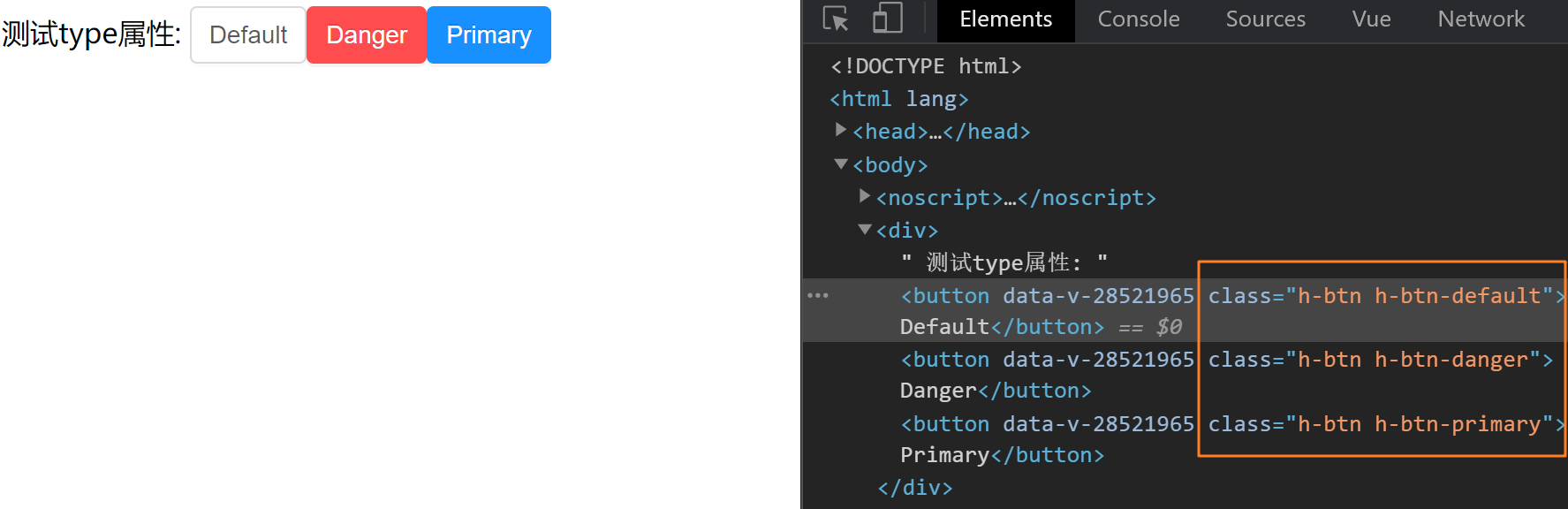
1.5 完成size配置
1. 准备对应class类
components/Button/index.vue,
<style scoped lang="less">
    // size:small
    .h-btn-small {
      padding: 4px 8px;
      font-size: 12px;
    }
    // size:large
    .h-btn-large {
      padding: 6px 12px;
      font-size: 16px;
    }
</style>
2. 编写props并根据不同的prop切换class
components/Button/index.vue,
<template>
  <button class="h-btn" :class="[typeClass, sizeClass]">
    <slot></slot>
  </button>
</template>

<script>
export default {
// 在子类里通过 props 进行接收
  props: {
    size: {
      type: String,
      default(){
         return 'default'
      },
    }
  },
  computed: {
    sizeClass(){
      return `h-btn-${this.size}`
    }
  }
}
</script>
4. 测试size属性
App.vue,
<template>
  <div>
    测试size属性:
    <h-button>Default</h-button>
    <!-- 将 type 属性传递给子类 -->
    <h-button size="small">Small</h-button>
    <h-button size="large">Large</h-button>
  </div>
</template>

<script>
import HButton from '@/components/Button'
export default {
  components:{
    HButton
  }
}
</script>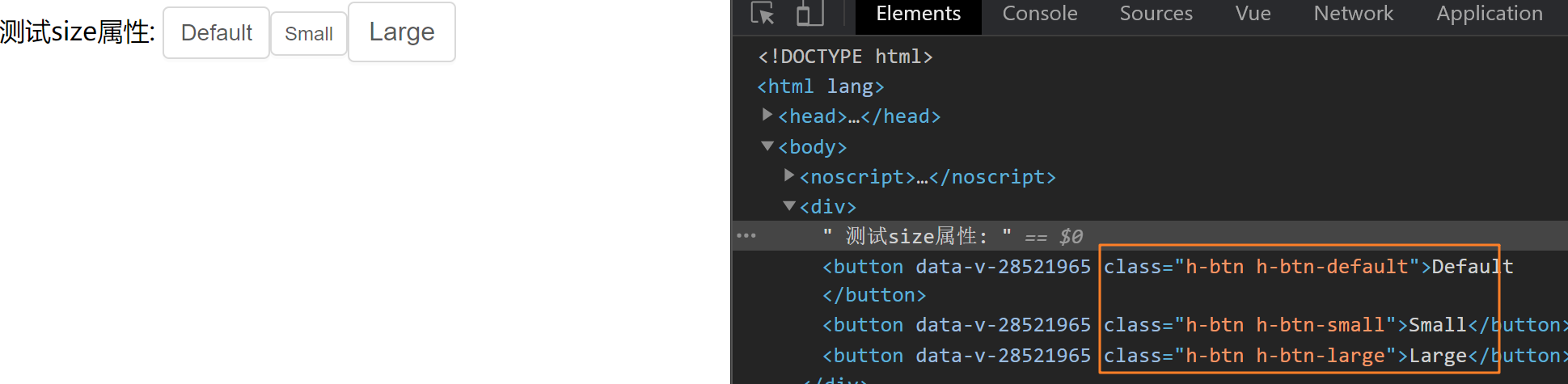
5.实现参数的校验
有时候用户并不会按照要求来,比如我们这里只有 type="danger" 以及 type="primary" 但是用户非要将其改成其他值 type="big"
因此就需要用到参数校验
components/Button/index.vue,
  props: {
    type: {
      type: String,
      default: 'default' // props 的默认配置,如果不传以默认为主
    },
    size: {
      type: String,
      default: 'default',
      // 参数校验
      // value 表示当前传递过来的值
      validator: function (value) {
        // 对传入的参数值做校验,满足返回true,否则返回false
        // 如果传入的参数不在可选参数中,给出用户提示,告知哪个参数传错了
        const sizeList = ['small', 'large', 'default']
        return sizeList.includes(value)
      }
    }
1.6 完成事件绑定
1.组件直接绑定click事件
App.vue,
<template>
  <div>
    <h-button size="large" @click="clickHandler">Large</h-button>
  </div>
</template>

<script>
import HButton from '@/components/Button'
export default {
  components:{
    HButton
  },
  methods:{
    clickHandler(){
     console.log('按钮点击了')
    }
  }
}
</script>
测试发现,点击事件并没有绑定成功,接下来我们说一下,vue系统中的事件系统
-
浏览器原生事件 (在浏览器支持的原生标签上绑定的事件)
<button @click="handler"></button>
-
组件事件 (在组件身上绑定的事件)
<h-button @click="handler"></h-button>
组件绑定的事件默认是不会被浏览器识别的,我们需要做额外的处理让事件生效,有俩种方案:
-
添加
.native修饰符添加修饰符之后,事件会被绑定到组件的根元素身上
-
把click当成自定义事件通过
$emit执行(推荐)
2. 使用$emit方法触发事件
用户的本意是想在点击button按钮的时候,触发组件身上绑定的click回调函数
App.vue,
<h-button @click="clickHandler">Defualt</h-button>

  methods: {
    clickHandler(e){
      console.log('按钮点击了', e);
    }
  }
components/Button/index.vue,
<template>
  <button @click="clickHandler">
    <slot></slot>
  </button>
</template>

<script>
export default {
  methods: {
    clickHandler(e) {
      // 触发自定义事件click,并传递事件对象e
      this.$emit('click', e)
    }
  }
}
</script>
1.7 总结
- 编写组件时应该API先行,先确定组件该如何给用户用,再根据API编写逻辑
- props的名称应该具备语义化,类型应该符合规范,并且可以添加自定义校验
- 组件上绑定的类似于原生的事件,默认是不会被识别的,需要额外处理
- 组件有一些设计需要整体把控,比如props与对应类名的匹配,这是我们故意设计的
完整代码:
components/Button/index.vue,
<template>
  <!-- <button class="h-btn" :class="typeClass"> 或 -->
    <!-- 动态class的数组语法可以同时支持多个动态class的绑定 -->
  <button class="h-btn" :class="[typeClass, sizeClass]" @click="clickHandler">
    <slot />
  </button>
</template>

<script>
export default {
  // 在子类里通过 props 进行接收
  // 根据不同的 type 值,给 button 绑定不同的类名
  // default --> h-btn-default
  // primary --> h-btn-primary
  // danger --> h-btn-danger
  // 通用计算公式:type -> h-btn-type
  props: {
    type: {
      type: String,
      default: 'default' // props 的默认配置,如果不传以默认为主
    },
    size: {
      type: String,
      default: 'default',
      // 参数校验
      // value 表示当前传递过来的值
      validator: function (value) {
        // 对传入的参数值做校验,满足返回true,否则返回false
        // 如果传入的参数不在可选参数中,给出用户提示,告知哪个参数传错了
        const sizeList = ['small', 'large', 'default']
        return sizeList.includes(value)
      }
    }
  },
  computed: {
    typeClass(){
      return `h-btn-${this.type}`
    },
    sizeClass(){
      return `h-btn-${this.size}`
    }
  },
  methods: {
    clickHandler(e){
      // 触发父组件传下来的自定义事件 click
      this.$emit('click', e)
    }
  }
}
</script>

<style scoped lang="less">
// 默认背景色 默认大小 基础样式 不管传什么参数这个样式都在
.h-btn {
  line-height: 1.499;
  position: relative;
  display: inline-block;
  font-weight: 400;
  white-space: nowrap;
  text-align: center;
  background-image: none;
  box-shadow: 0 2px 0 rgba(0, 0, 0, 0.015);
  cursor: pointer;
  transition: all 0.3s cubic-bezier(0.645, 0.045, 0.355, 1);
  -webkit-user-select: none;
  -moz-user-select: none;
  -ms-user-select: none;
  user-select: none;
  touch-action: manipulation;
  padding: 5px 10px;
  font-size: 14px;
  border-radius: 4px;
  color: rgba(0, 0, 0, 0.65);
  background-color: #fff;
  border: 1px solid #d9d9d9;
}
.h-btn-default:focus {
  outline: 0;
}
// primary 确定样式
.h-btn-primary {
  color: #fff;
  background-color: #1890ff;
  border-color: #1890ff;
  text-shadow: 0 -1px 0 rgba(0, 0, 0, 0.12);
  box-shadow: 0 2px 0 rgba(0, 0, 0, 0.045);
}
// danger 危险样式
.h-btn-danger {
  color: #fff;
  background-color: #ff4d4f;
  border-color: #ff4d4f;
  text-shadow: 0 -1px 0 rgba(0, 0, 0, 0.12);
  box-shadow: 0 2px 0 rgba(0, 0, 0, 0.045);
}

// size:small
.h-btn-small {
  padding: 4px 8px;
  font-size: 12px;
}
// size:large
.h-btn-large {
  padding: 6px 12px;
  font-size: 16px;
}
</style>
App.vue,
<template>
  <div id="app">
    测试 type 属性:
    <h-button>Defualt</h-button>
    <!-- 将 type 属性传递给子类 -->
    <h-button type="primary">Primary</h-button>
    <h-button type="danger">Danger</h-button>

    <br>
    <br>

    测试 size 属性:
    <h-button>Defualt</h-button>
    <!-- 将 type 属性传递给子类 -->
    <h-button size="small">Primary</h-button>
    <h-button size="large">Danger</h-button>

    <br>
    <br>
    事件测试:
    <h-button @click="clickHandler">Defualt</h-button>
  </div>
</template>

<script>
import HButton from './components/Button'
export default {
  name: 'App',
  components: {
    HButton
  },
  methods: {
    clickHandler(e){
      console.log('按钮点击了', e);
    }
  }
}
</script>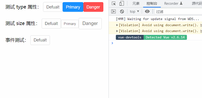
二、Editor编辑器组件开发
Button组件的编写,我们是从零开始的,接下来我们借助一些开源的三方基础插件,完成我们自己编辑器组件的编写
组件依赖:wangEditor
安装依赖: npm i wangeditor --save
2.1 确定基础API
指令
| 指令名 | 说明 | 类型 | 默认值 |
|---|---|---|---|
| v-model | 提供编辑器数据的双向绑定 | String | 无 |
2.2 编写测试基础Editor
编写Editor组件
components/Editor/index.vue
<template>
  <div class="editorContainer" ref="editor"></div>
</template>

<script>
import E from 'wangeditor'
export default {
  methods: {
    initEditor(){
      // 编辑器初始化操作
      const editor = new E(this.$refs.editor)
      // 或者 const editor = new E( document.getElementById('editorContainer') )
      editor.create()
    }
  },
  mounted(){
    // 在这里初始化保证dom是存在的
    this.initEditor()
  }
}
</script>
测试组件
App.vue
<template>
  <div>
    <Editor/>
  </div>
</template>

<script>
import Editor from '@/components/Editor'
export default {
  components:{
    Editor
  }
}
</script>
2.3 完成v-model双向绑定
前置知识
当我们在一个组件身上通过v-model绑定一个响应式数据时,记住,他是一个语法糖,实际上相当于完成了俩件事情
- 组件上绑定了一个名为
value的自定义属性 - 组件身上绑定了一个名为
input的自定义事件
1. 接受数据传入
App.vue,
<template>
  <div>
    <Editor v-model="content"/>
  </div>
</template>

<script>
import Editor from '@/components/Editor'
export default {
  components:{
    Editor
  },
  data(){
    return {
      content:'我是编辑器'
    }
  }
}
</script>
Editor/index.vue,
<template>
  <div class="editorContainer" ref="editor"></div>
</template>

<script>
import E from 'wangeditor'
export default {
  props: {
    // 接收数据传入
    value: {
      type: String
    }
  },
  methods: {
    initEditor() {
      const editor = new E(this.$refs.editor)
      editor.create()

    }
  },
  mounted() {
    console.log('传过来的数据为', this.value)
    this.initEditor()
  }
}
</script>
2. 实现数据回显
数据我们拿到了,然后就可以把它渲染到编辑器内部了,编辑器有一个方法是专门用来设置内容的,我们找到它,
editor.txt.html('富文本内容')
Editor/index.vue,
initEditor() {
  const editor = new E(this.$refs.editor)
  // 监听编辑器改动事件,把最新内容传出去
  editor.config.onchange = (newHtml) => {
    console.log('change 之后最新的 html', newHtml)
    this.$emit('input', newHtml)
  }
  editor.create()
  editor.txt.html(this.value)
}
4. Bug修复
看起来我们实现了数据的传入回显和修改时的内容传出,接下来我们在 App.vue 中动态的修改一下传入的
content,看看编辑器有没有实时响应得到显示
我们通过调试工具,修改content属性的值,发现编辑器并没有得到显示,然后再查看props数据,发现最新的数据已经传进去了
之所以没有显示到编辑器中,是因为编辑器类似一个独立的个体,它并不知道props已经变成新内容了,所以我们的思路是: 监听props的变化,然后把props的值设置到编辑器里
如何监听 - watch
如何设置 - editor.txt.html()
Editor/index.vue,
initEditor() {
const editor = new E(this.$refs.editor)
editor.config.onchange = (newHtml) => {
console.log('change 之后最新的 html', newHtml)
this.$emit('input', newHtml)
}
editor.create()
editor.txt.html(this.value)
// 为了能使用editor对象,我们采取一个更加灵活的命令式监听写法
this.$watch('value', () => {
editor.txt.html(this.value)
})
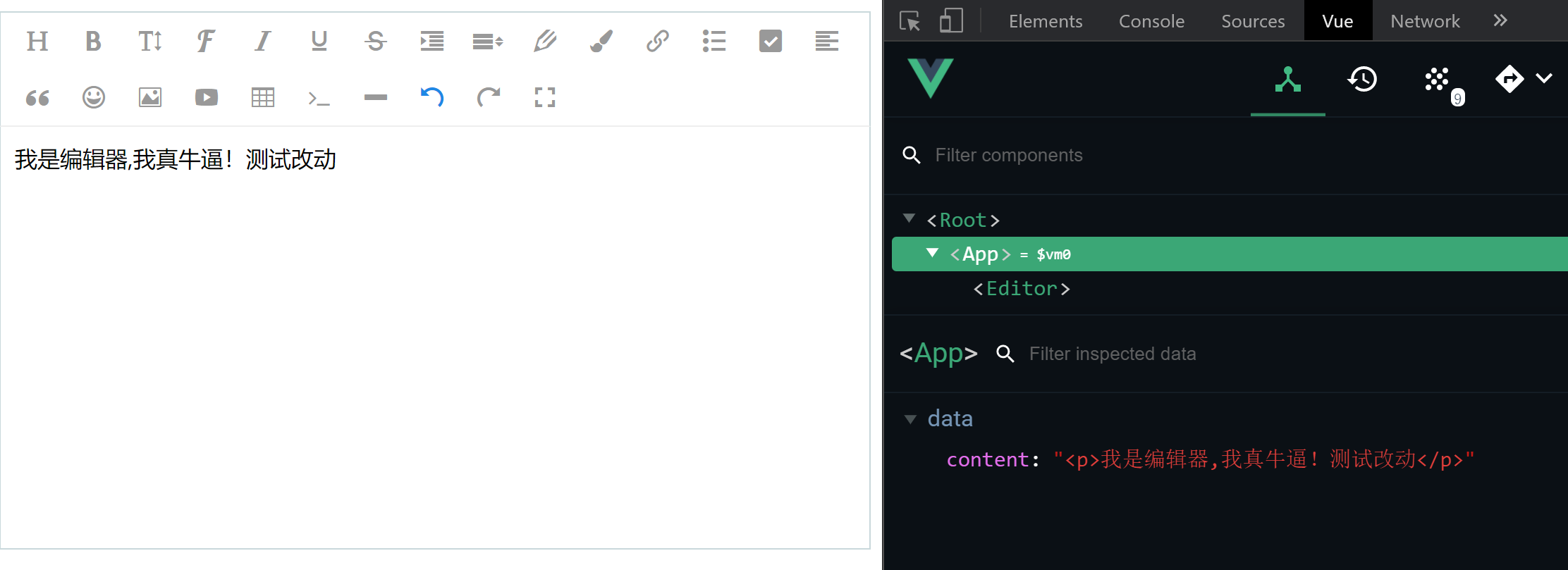
}再次测试,发现双向绑定已经完全正常,nice~
2.4 总结
通过这一节的学习,我们应该掌握以下知识点
- 组件上绑定
v-model等同于做了什么 - watch监听的另外一种调用方法命令式的监听方法,功能一样
- 使用三方现成的开源插件编写自己组件的流程(基础使用 、三方方法调用)
完整代码:
Editor/index.vue,
<template>
  <div ref="editorRef"></div>
</template>

<script>
import E from 'wangeditor'
export default {
  methods: {
    initEditor(){
      // 编辑器初始化操作
      const editor = new E(this.$refs.editorRef)

      // 配置 onchange 回调函数
      // 目的是为了能够知道什么时候内容发生了变化
      editor.config.onchange =  (newHtml) => {
        // newHtml 拿到的就是编辑器中最新的内容
        // 我们需要把这个内容抛出去交给父组件
        this.$emit('input', newHtml);
        console.log("change 之后最新的 html", newHtml);
      };

      editor.create()
      // 重新设置编辑器内容
      editor.txt.html(this.value)

      /**
       * bug 修复:
       * 当传入的数据发生变化的时候,props中的value已经拿到了最新的值
       * 但是并没有及时的同步到编辑器中
       * 实现思路:
       * 每一次content发生变化,props中都能拿到新值
       * 我们可以利用 watch 进行监控 props 中的 value ,一旦 value
       * 发生变化,就重新执行一下设置编辑器内容的方法即可
       */
      // 命令式监听,灵活,可以在任何位置使用
      // 参数一:要监听的属性
      // 参数二:监听的属性发生变化之后的回调函数

      /**
       * $watch 和 watch 配置项内部实现的核心原理是一致的,但是 $watch 更加
       * 灵活,它并不是组件一进行初始化就立刻监听的而是在任意时刻也就是你想要
       * 监听的时候才监听的
       */
      this.$watch('value', () => {
        console.log('value发生了变化');
        editor.txt.html(this.value)
      })
    }
  },
  mounted(){
    // 在这里初始化保证dom是存在的
    this.initEditor()
  },
  props: {
    value: {
      type: String
    }
  }
}
</script>

<style>

</style>
App.vue,
<template>
  <div id="app">
    <!--
      1. 编辑器组件可以接收我传入的数据,并且可以显示到编辑器内部,实现数据的回显
      2. 一旦编辑器中进行内容编辑之后,绑定的 content 字段也可以得到修改,变成编辑器中最新的值

      体现出来的就是双向绑定的特性
     -->
     <!--
       实现步骤:
       1. 实现回显
        v-model 一旦写到一个组件上,默认情况下相当于传入了名为 value 的自定义属性,以及名为 input 的自定义事件

        2. 编辑器一旦编辑内容就把绑定的 content 属性修改掉
          难点1:如何知道内容已经编辑了 第三方插件提供了方法
          难点2:如何拿到最新的编辑器内容,然后传出来交给 content(子传父)
      -->
    <Editor v-model="content"></Editor>
  </div>
</template>

<script>
import Editor from './components/Editor'
export default {
  name: 'App',
  data(){
    return {
      content: '我是编辑器'
    }
  },
  components: {
    Editor
  },
  methods: {
  }
}
</script>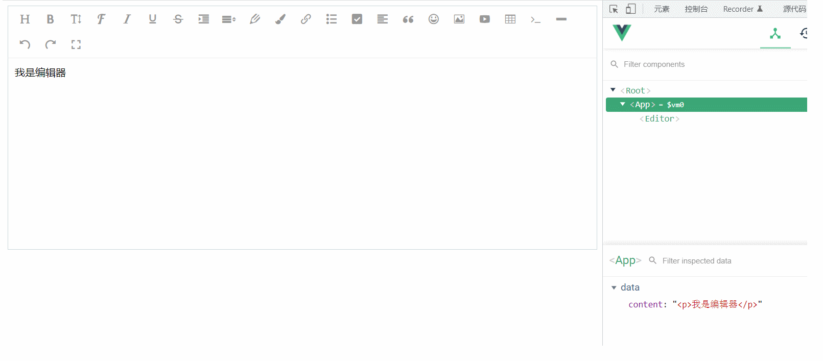

CSDN联合极客时间,共同打造面向开发者的精品内容学习社区,助力成长!
更多推荐

 4
4 0
0- 0


 已为社区贡献2条内容

所有评论(0)